Mapping a palette
A collection of twelve watercolour paints feels like a lot until you sit down and start to work on painting a specific thing. “Do I have the right set of paints for the kind of paintings I want to create?” is something I often see asked about.
I wanted to see whether I could help to answer that question, and do it in a way that a watercolourist could use as part of their practice. Doing that meant finding a way to visually represent what happens when you mix watercolour paints at different dilutions; watercolour is particularly fun because the paper plays such an important role in representing lightness. Above all, it meant creating something a painter could glance at and feel.
What I was trying to do
The specific thing that painter has in mind is important here. I’m not interested in ‘what paints are best’ in the abstract or optimising for the broadest coverage from the fewest paints (although of course I went down that rabbit hole too - that’s where the first video came from). What I am interested in is finding the best paints for a style: architectural vs pastoral vs portraiture vs botanical. Each style pulls the desired palette in different directions, so I set out to find an intuitive way to present to an artist what their current palette can and can’t reach for that given style.
Before I committed too much time to building this, I wanted to see if it was possible to show this in a way that made sense, and gave the artist a tool to explore and help them make informed decisions about their palette - what to add, what to cut.
What the proof of concept does
What I built was a way to map where you can reach with colour with the paints you have in your collection, and just as importantly to show the parts of the map where you need to get to (for a style) but can’t without adding more paint.
- Every paint can be diluted, and any two can be mixed. So a palette doesn’t reach a list of colours, it reaches a region of colour.
- Fill that reachable region with the actual colours it can make.
- Punch white holes where a colour you’d want sits beyond reach.
- Coloured areas mean you can mix it.
- White areas mean you can’t, but it’s reachable with the right paint.
- Black areas mean no pigment gets there at all.
Testing against a theme: the botanicals
Here’s what that looks like in practice. This image shows the colours needed to paint a sample set drawn from real flowers. I used hundreds of photos of flowers to understand what colours come up the most often and these became my test set.
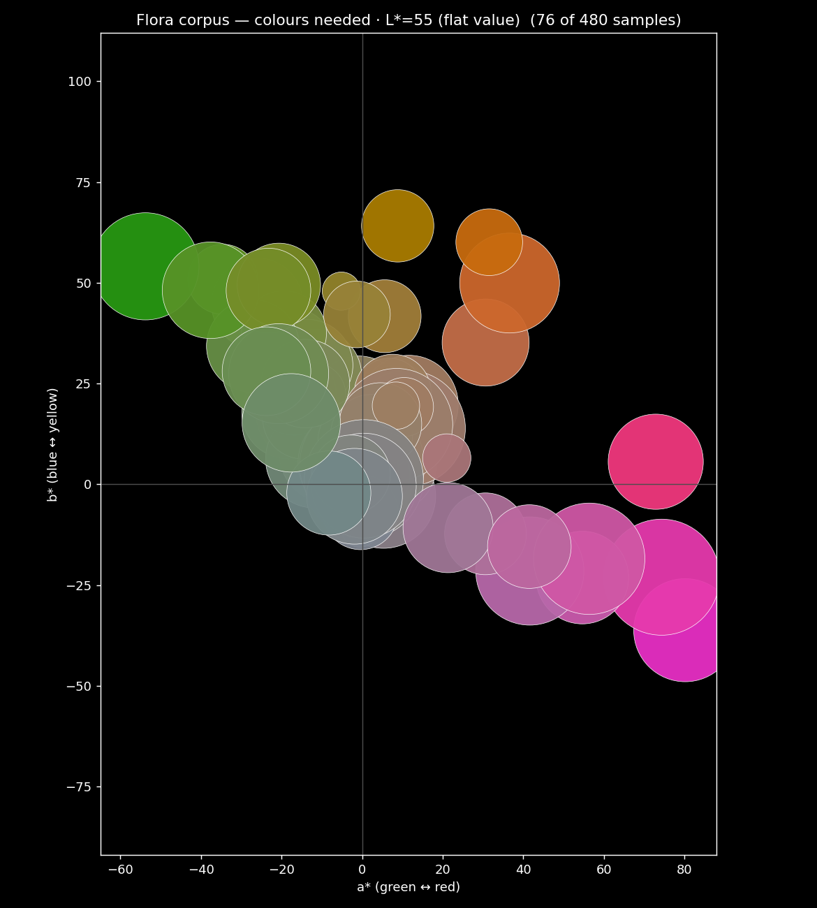
When you overlay the reachable colours accessible from your palette and the region of colour you want, you get to see where your palette is covering, and where its gaps are.
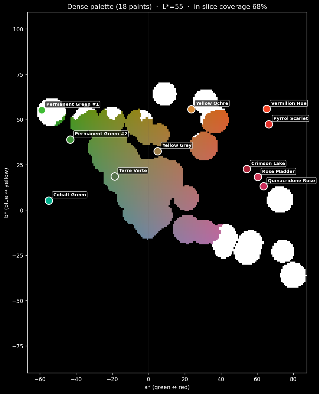
Like a real map, what’s shown here is a simplification, our territory is actually 3 dimensional too, but our third dimension isn’t height, it’s lightness. So this shows a slice through the map at a specific lightness, kind of like a contour line does. To make this work across all levels, we need to look at each level of lightness and see how much our palette reaches. Here’s what that looks like with 18 paints in the palette.
And for comparison, here’s the same desired region of colour but with far fewer colours: this time just 3.
We can see some important information in the 18 colour palette - the gap isn’t uniform across lightness values: if you were to only look at say, Lightness/L* of 60, a palette would look healthy at mid-tones but be falling apart in the shadows (literally).
Why scrubbing through lightness earns its place
Building a tool that turns a static gamut chart into something temporal you read with your eye will allow an artist to scrub through the whole range of values, picking up on these important gaps.
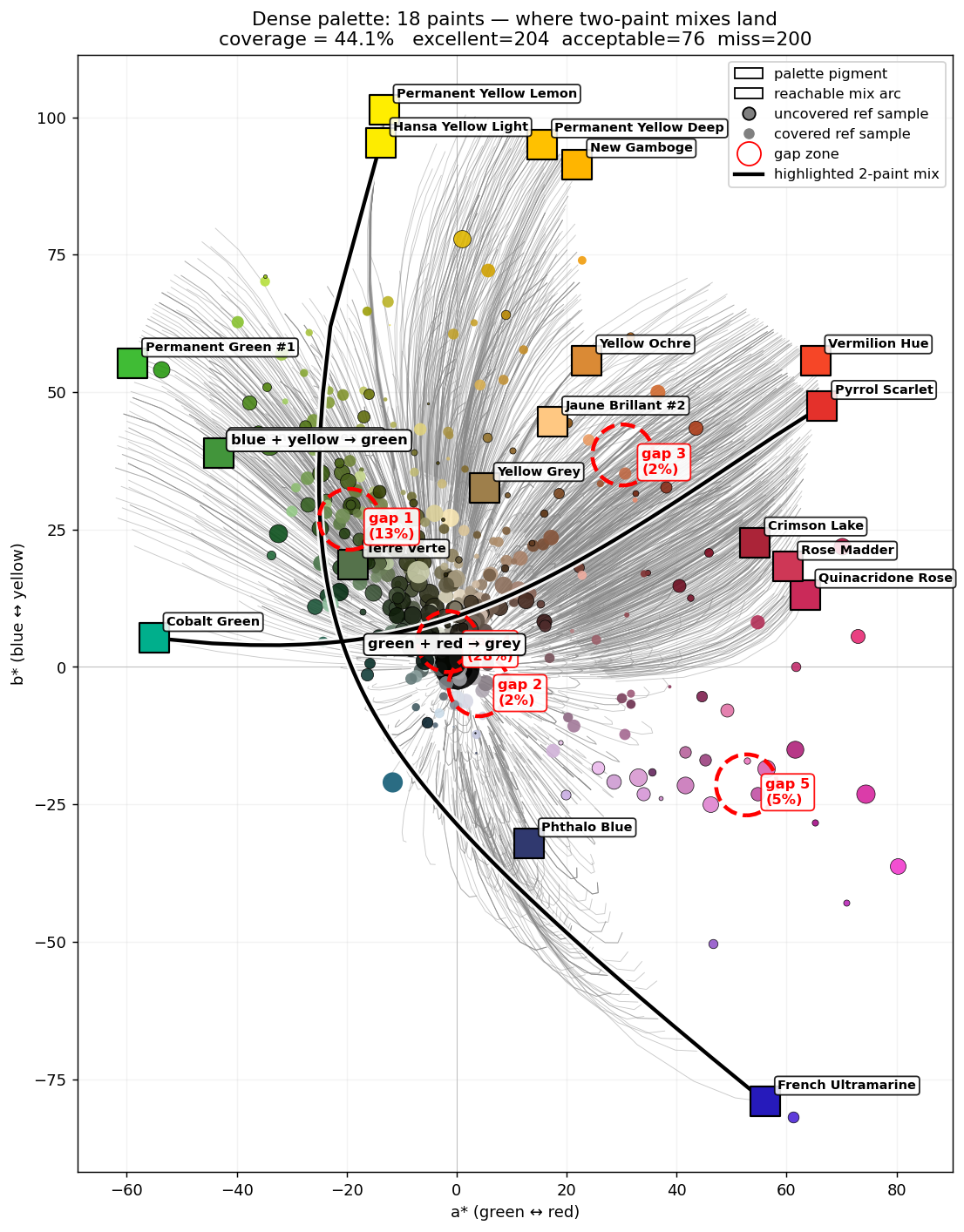
Another thing that I found in this was that mixing is seriously non-obvious. One of the most common pieces of feedback from artists about Undertint is that they’re surprised by the mixing recipes that Undertint suggests. Often the mixes seem highly counterintuitive, but really work. When mapping the mixes you can start to see why: the paint that reaches to fill one region is often nowhere near that region’s colour because of what it mixes into.
If you want to play with the shape itself, I stacked every one of those lightness slices back into the solid they came from: spin the palette in 3D.
Where this goes
So back to the app and its UI. If you can make those gaps visible - if you can show where your palette can’t reach - then the obvious next move is to allow someone to tap it: “if you’re missing this region, here’s the one paint from the collection that fills the most of it.”
It’s likely that I’ll start with images provided by the artist so it reflects the kind of subjects they want to use (and avoids any copyright issues), but further down the road I’ll work out a way to build the corpus of images I need to be able to answer the styles question and allow users to pick a theme (architecture / botanical / portraiture), see their palette against it, and get pointed at the best additions.
While the palette-mapping work is still on the bench, the colour-matching half of all this is already available. Undertint takes your photo and hands you mixing recipes from the paints you actually own. If the mixes here made you curious, that’s the part you can hold today, and I’d genuinely like to know what it gets right and where it doesn’t.