A tool to help get your organisation into shape
 Doctrine Grid Tool
Updated 2020.09.04: Purkis Layout added.
I wanted to use Simon Wardley’s very helpful set of universally useful patterns (aka Wardley’s Doctrine) in some forthcoming research I’m planning to do with a large organisation. When I’ve used it in the past it’s been pretty much as described in this tweet.
X : Any strategy tips?
— Simon Wardley (@swardley) June 2, 2018
Me : Yes … Don’t.
a) Get 10-15 ppl in your org to colour the chart (attached) which will probably look “all red” (see banking).
b) Take action to make it “more green”
c) When it looks more like the “e-commerce” giant, you’ll be ready to discuss strategy. pic.twitter.com/fahBubkvx4
Print out some black and white grids, ask the person to colour each pattern in to denote how well developed the pattern is within the organisation (in that participant’s opinion) and then aggregate the data and use that to identify where next to focus attention. It’s a really simple, but very powerful tool.
So of course I wanted to make it a little bit more powerful, and because I’ve got a bit of time on my hands after quitting Tesco, decided to see if I could make a tool that captured everything using a form and held it all in a spreadsheet. My line of thinking here was it might be interesting to compare how different parts of the organisation saw things. It also meant that I’d find it easier when working across different countries.
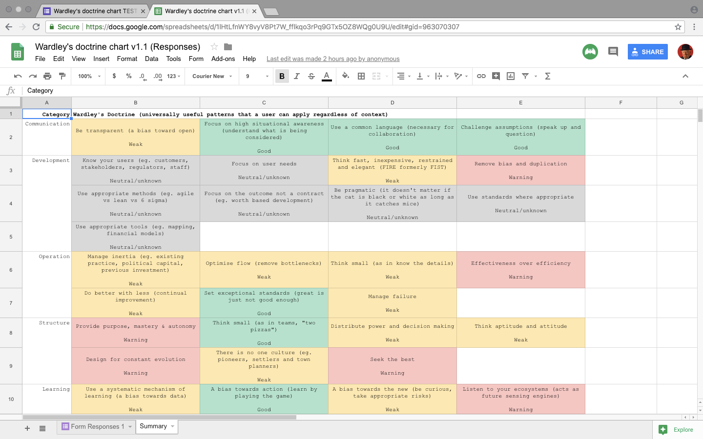
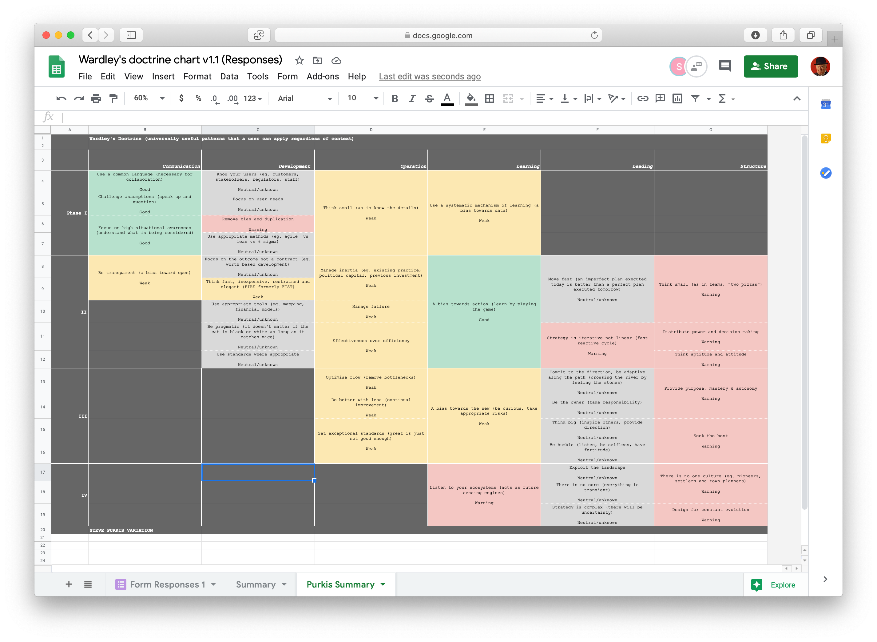
Anyway, here’s where I got to with it - it’s very rough and ready, but it’s good enough. I’ve used Google Forms and Google Sheets. The form simply asks the respondent to assign a value (Good, Unknown/neutral, Weak, or Warning) for each of the patterns. The spreadsheet does the fun stuff, capturing everyone’s responses on the first sheet (with a summary result for each pattern) and on the second sheet taking all of the organisations’ responses and putting them into one of Simon’s original grids.
Some links
- The form builder: https://docs.google.com/forms/d/13xFw7PoTEwHXd82UeuOC9p0et3CbiDACS295ZXKWfmA/edit?usp=sharing
- An example of the form: https://goo.gl/forms/XTh6t6UjRJVCe34a2
- The spreadsheet: https://docs.google.com/spreadsheets/d/1lHtLfnWY8vyV8Pt7W_fflkqo3rPq9GTx5OZ8WQg0U9U/edit?usp=sharing
Please feel free to create your own copies for your own use. The easiest (I think, I’ve yet to confirm this) way to do this is to:
- Make a copy of the form builder
- Make a copy of the spreadsheet
- In the form builder, relink the form to your copy
Of course I’d really love any feedback or advice on improving the tool and I’d be completely overjoyed to hear if you do use them yourself, you can always find me grumbling about product and design on Twitter.
What needs improving
I really don’t like the way I’ve aggregated each pattern’s score for the grid, this is because I’ve no idea how best to handle things when half the respondents score a pattern as Good and half score it as Warning - clearly something interesting is going on here, but how best to represent it? With my information design hat on I’m thinking that there probably needs to be a better way to show the underlying detail rather than blocking it off with a single ‘score’.
When I was creating this, one thought in my head was, ‘people aren’t going to understand all these patterns without me being there to explain’. And when I asked for feedback from my friend Richard Warner who’s another keen Wardley mapper, he said (after doing some impromptu user research with his wife) that she was confused by some of the terminology and labels, such as Warning.
So yes, clearly room for improvement, but like I said it’s good enough for now. Like I said, let me know if you find it useful.
Update 2020.09.04
I’ve finally got around to reworking the summary so that you can see both the Simon’s original layout and the improved Steve Purkis version.
 Purkis layout in Wardley Doctrine Grid Tool
Wardley Maps Simon Wardley product strategy tools