What Undertint is, and why I made it
You’ve spotted a colour you want to paint: the blue-grey of a shadow on a wall, the warm green of a particular leaf, the exact dusty-white on the cake your youngest daughter just baked. You can see it but translating it into a mix from the tubes on your desk is the hard bit, and getting it wrong by even a little is the difference between a painting that sings and one that doesn’t.
Most apps that try to help with this hand you back a colour code, a short string of letters and numbers that describes what colour your screen would display. That’s useful if you’re designing a website. It’s almost entirely useless on paper. Watercolour doesn’t mix the way colours on a screen do. When you mix yellow and blue light on a screen, you get a pale grey. When you mix yellow and blue paint on paper, you get green. Same colours going in but different rules coming out, because a screen adds light to itself and paint filters light through pigment.
Undertint approaches this challenge from the other end. The thing you actually own as an artist are tubes of paint, not colour codes. The thing you actually want is a recipe: two parts of one paint, one part of another, at a particular dilution, with a sense of how close it’ll get you. That’s what it’s designed to give you.
How the science underneath works (briefly)
The maths isn’t new, people have been modelling how pigments mix on paper since the 1930s. There’s a well-tested set of equations, named after the two physicists who worked them out that predicts what happens when you blend two pigments together and how the mixture changes as you add water. What’s new is having a phone in your hand fast enough to run those calculations live, and a database of real paints to run them against.
To build that database each paint gets a small painted swatch, and a handheld device reads exactly which wavelengths of light bounce back from it. Two paints can both be called “French Ultramarine” and behave noticeably differently on paper. Only measuring them tells you the difference. The current build of the app ships with many of the most popular watercolour sets, plus a handful of extra paints I’ve added while testing. More are on the way (and you can always ask me for specific ones).
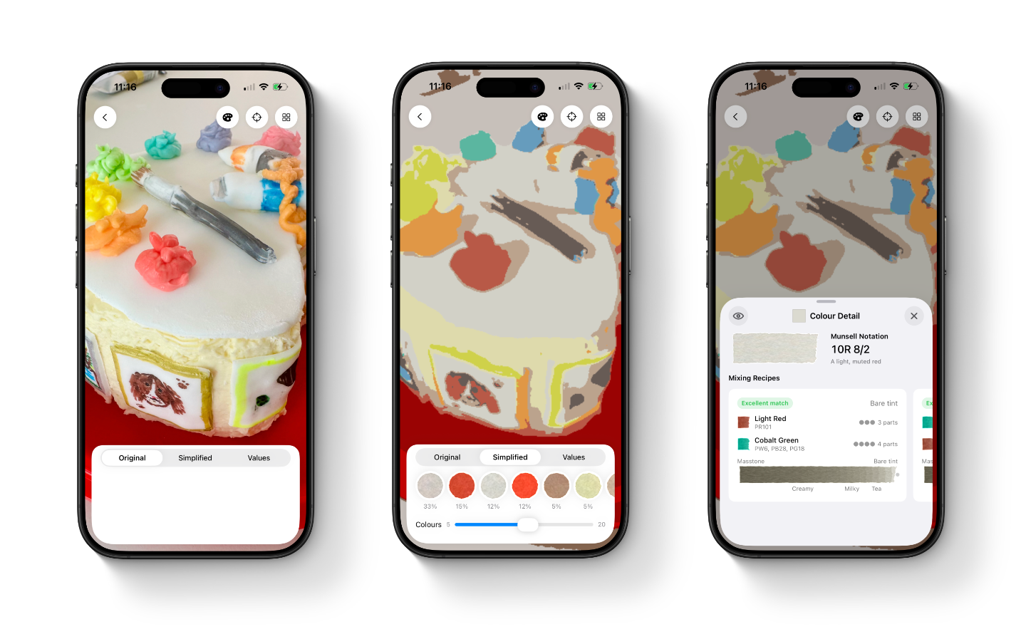
What the app actually does
The app is designed around the way painters already work. Drop in a reference photo and Undertint simplifies it into a small set of paintable colours, the way you’d squint at a scene to find its big shapes. Tap one of those colours and you get a mixing recipe: which paints, in what proportion, and at what dilution (described in painters’ words, “milky”, “creamy”, “tea”, not unitless decimals). Drag a finger across the photo and the app reads the exact colour under your finger live, alongside the closest match in your own palette.
The swatches in the app are drawn to look like real watercolour washes, with the granulation and edge bloom you’d actually see on paper. That’s not decoration, it’s designed to be a visual prompt to help you build your study. A flat rectangle of colour lies about how the paint will land. A swatch that grains and pools the way Ultramarine grains and pools is a little more honest.
What’s still genuinely uncertain
A lot of what’s left to find out can only be found out by painters using it on real work. Do the dilution words match what you’d actually mix on your palette when you read them? Do the watercolour-style swatches help you judge a recipe, or do they mislead you into reading a preview as a literal prediction? Are the colours the app pulls out of a photo the ones you’d have pulled out yourself? Code can’t answer those questions. Painters can. Field testing is the next chapter, and a lot of the app will get sharper because of it.
The app exists to teach you to not need it.
That’s a principle I keep coming back to. Undertint isn’t trying to replace your eye, it’s trying to give it the structure it needs to get sharper, faster. The pigment codes printed on every tube, the way one wash becomes another as you add water, the fact that a “grey” shadow is almost never grey, but a low-chroma blue or violet at a particular value. All of this information lives in the app for now, with the goal that you eventually carry it around without needing to look at it.
This blog is where the working-out gets shown. The design decisions, dead ends, and things I got wrong before getting them less wrong. If you’ve ever wondered why your screen and your paper disagree about what red means, or why a paint that worked in someone else’s tutorial does something different in your hand, or why your greens keep going muddy, you might like Undertint. Give it a go and let me know what you make of it.