How we made the country’s most accessible grocery shopping app (without anyone noticing).
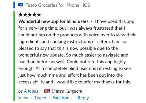
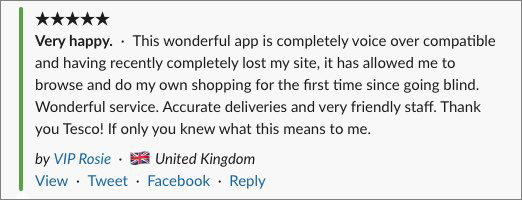
 Feedback we live for
Getting buy-in
- Make a compelling business case showing the large underserved market of customers to which no supermarket is making any attempt to capture
- Show how inclusive design and accessibility make the product better for everyone regardless of disability or impairment
- Let your leadership teams hear from customers who are being excluded from your services and how disappointed and frustrated they are by the experience
- Connect the work with your company’s values and mission - for example, pointing out that building accessible products and services is literally a ‘little help’
- Point out the legal requirements and argue the need to protect the business from needless risk of litigation
- Articulate how the careful design of well-designed, accessible, modular UI components means that while there’s an additional cost to their individual creation, the savings created by their re-use at scale are huge
- Talk about ethics - because fuck it, it’s a hot topic and why not use that too.
NOTE: none of this worked.
So good luck to you if you can make it work, but my experience is that while everyone will nod along and make the right noises, it’s rare that you’ll get the buy-in you’re after. At the very best people will ignore you and leave you to get on with things. So we just chose to do it and we were lucky enough to have a team of people that for various reasons didn’t care about what our bosses thought. In all other conversations that we’d had with Directors and leaders, we’d walked away with a the usual ‘it’s nice to have but it’s not a priority right now’. We all knew from past experience that our ethical arguments, our assertions about the Tesco brand, its values and our business cases would simply be ignored.
The reality was that I and a few others in the team knew we were fucking-off and so didn’t bother seeking permission.
Dumb luck and good timing
After yet another reorg, I found myself in the position of leading the design of Tesco Apps at a time when we were replatforming away from Xamarin and towards fully native Android/iOS apps. The state of the product design when I moved over to the team wasn’t great, and the team had been allowed to wander off deep into the weeds1 and were about to replatform and redesign the entire app. We quickly knocked that on the head, and moved to a far less stupid strategy of replatform then worry about redesigning anything, which meant a couple of things:
- Our focus moved from uncertainty about what the app might be to the specifics of what was worth keeping in the replatforming - we were now looking at the same app our customers were looking at.
- We released design effort from going into the act of creating certainty from possibility, which meant freed-up capacity for the team that could be directed elsewhere
So where did this capacity go? The team wanted to use it to lay down some strong foundations for the app in preparation for later iterations and change. There was a real sense in the team that the work we needed to do was to establish some clear principles and norms that would ensure that the app could respond quickly to our customers’ needs and expectations without creating unmanageable debt: the team wanted to make sure that we were making the most of that rare opportunity to start afresh.
Shit umbrellas
The fact that we had people in the team who had already decided that they weren’t planning on sticking around definitely helped, and those of us who fell in that group were happy to provide the necessary cover for the team to do the work they believed in. For an overhead manager like me, this meant shielding the team from too much attention and pitching the work as dull, pedestrian grunt-work that nobody would want to get too involved with. Telling people that ‘we’re literally just copying the old app’ meant the show-ponies and portfolio-building types saw no shiny thing and so ran a mile, and the perceived dullness of the venture meant that the programme folks twitchy about risk were reassured sufficiently to let things roll forward without endless status updates.
Accessibility, Parsimony and Utility
If I had to characterise those core principles that we wanted to establish, they were accessibility, parsimony and utility. One of the team, Rob did a little bit of genius-work and saw a way to link these to Tesco’s strapline of ‘every little helps’ and created a mnemonic which we came back to often.
Every = is it designed for everyone?
Little = have we pared this back to its essentials? And,
Helps = are we maximising for usefulness?
So right there, in our principles for the product was the intent to ensure that the app we were working on was accessible to everyone.
One of the things that we got for free when we started using native UI frameworks, was much deeper integration with the OS accessibility support. Given our principles, we’d have been idiots not to have made use of those and everyone in the team was interested and keen to use these hooks. I think we were particularly fortunate to be working with The App Business who provided pretty much everyone in the team working on engineering, testing and delivery as well as some truly great designers. TAB totally understood what we were trying to do, and the whole team there were as passionate and interested as we were about making the new app accessible to everyone - rather than seeing accessibility as an option or an aspiration, they shared our belief that it needed to baked in from the very beginning: in our UI design, in our development process, and in our tests and reviews. The team chose to use accessibility and inclusion as healthy constraints which guided us towards building a better product.
 And more…
Some lessons
- Belief matters: everyone in the team felt that we had a duty to ensure that the new app worked for everyone: we had a strongly held shared belief
- Work with interested people. We had a team of people who were deeply interested in the mission we had set ourselves: to be the most accessible shopping app in the UK
- Choose the right constraints to guide the product development towards goodness - for us, that was accessibility, parsimony and utility. YMMV
- Trust and safety. We had a team that could be left to their own devices - I knew my role was to create the space for the them to make the right decisions, and ensure they felt safe to work in freedom
Tinder, but for grocery shopping anyone?↩︎
product design product strategy accessibility tesco